How to Create a District-Level Map of India in 5 Minutes
A step-by-step guide to creating a professional district-level map of India using your own data. No GIS software, no coding, no boundary file uploads just paste your data and go.

April 8, 2026
So you've got a spreadsheet full of district-level data for India. Maybe it's sales numbers, health stats, election results, or something else entirely. You know a map would tell the story way better than rows and columns ever could. But here's the thing: actually making that map usually means wrestling with GIS software, hunting for shapefiles, or writing code you'd rather not touch.
It doesn't have to be that way. With iipmaps, all 700+ district boundaries are already baked in, and you can go from raw data to a finished map in about 5 minutes. Let me walk you through it.
What You'll Need
An iipmaps account (free to start)
Your data in a spreadsheet or your clipboard, with one column for district names and another for whatever you're measuring
That's genuinely all you need. No GIS background, no shapefiles to download, no code to write.
Step 1: Pick the District Map Template
Once you log in, you'll land on a dashboard full of map template cards. You'll see options like India, World, USA, and a bunch of others. The one you want is "Districts of India". Just click on it.
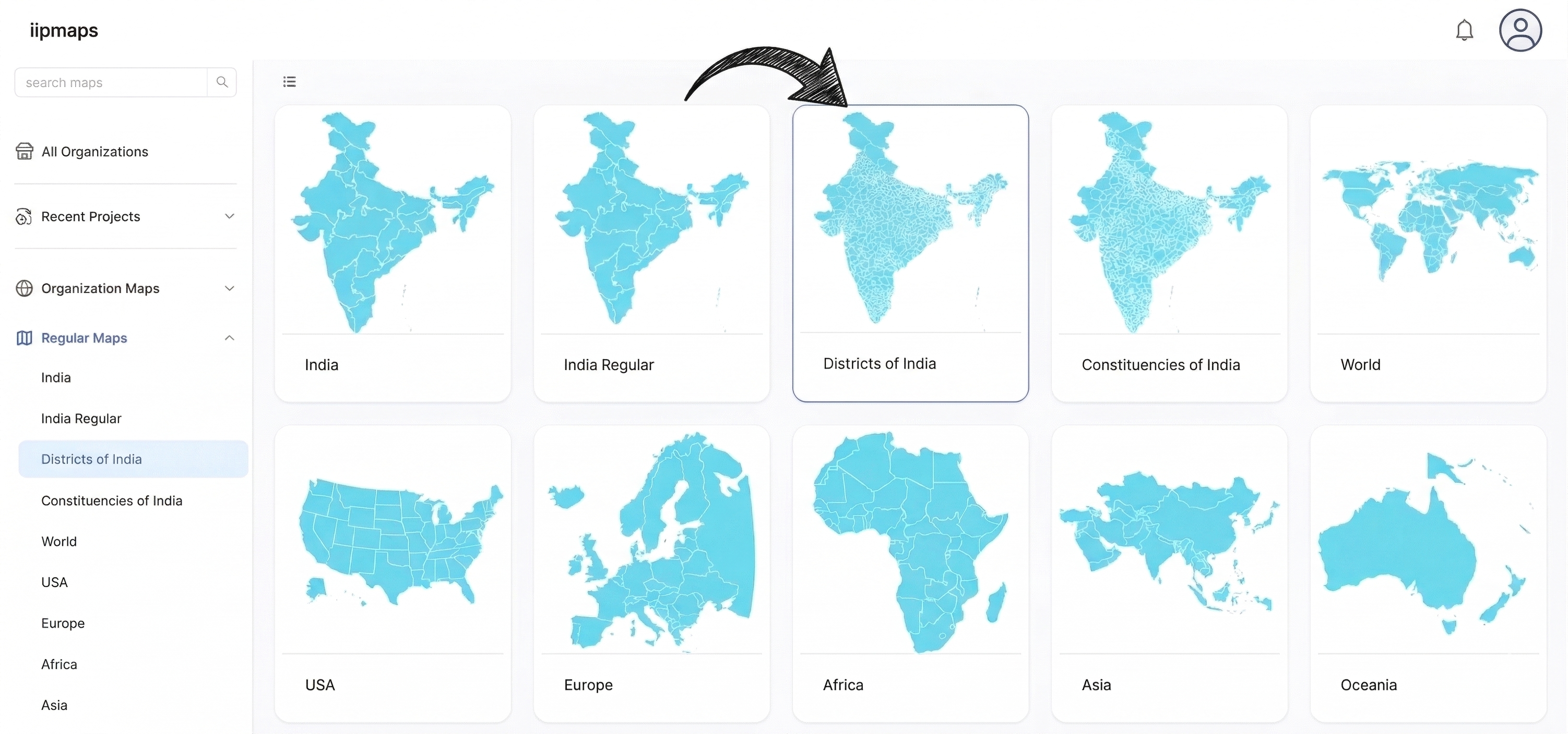
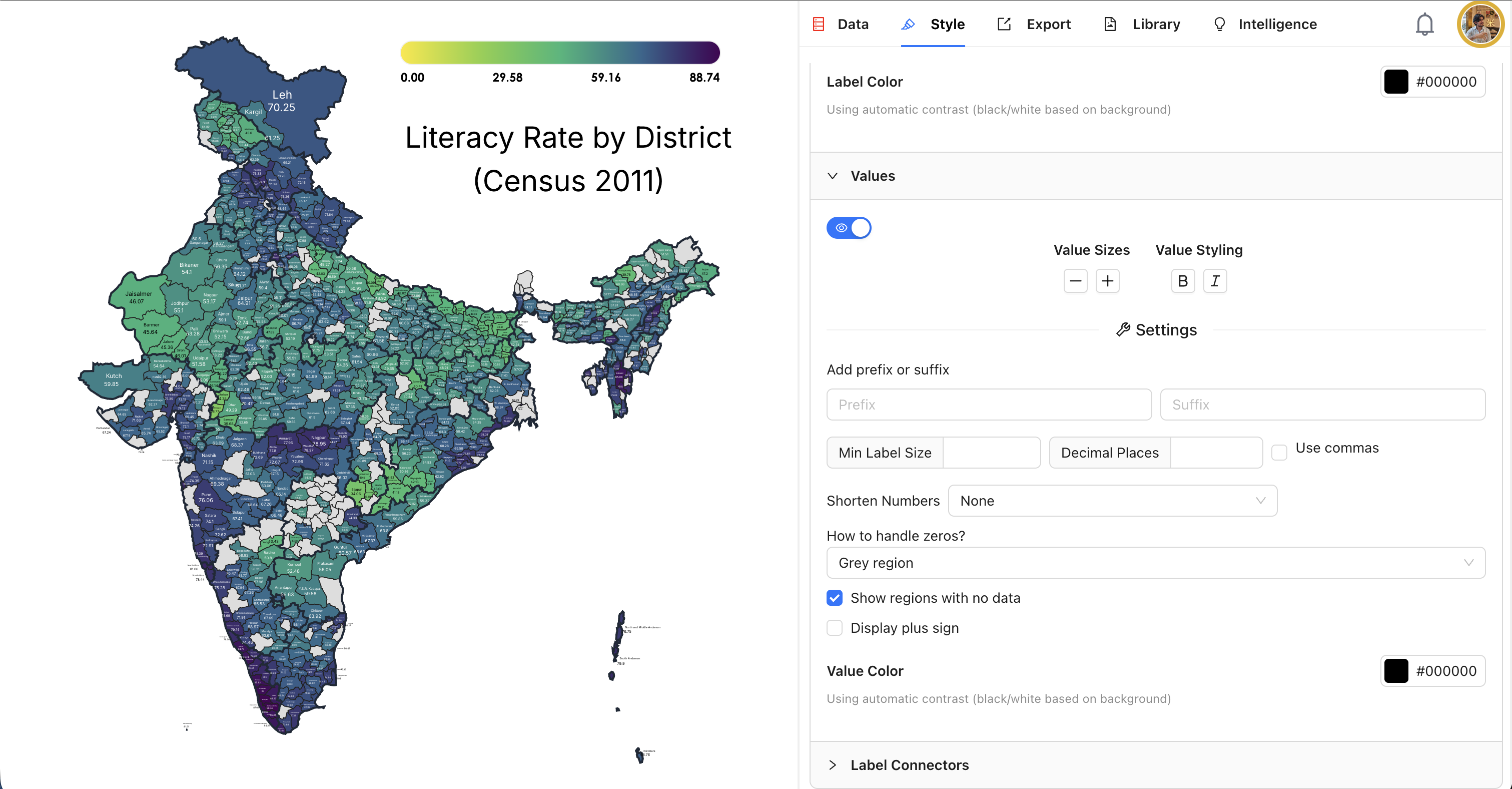
That opens up the map editor, and you'll immediately see a blank map of India with every single district boundary already drawn in. Over 700 of them, all accurate and up to date. On the right side, there's a panel with five tabs: Data, Style, Export, Library, and Intelligence. You'll start in the Data tab.
Step 2: Add Your Data
This is the part that usually takes forever in other tools. Here, you've got two simple ways to get your data in:
The fast way: Paste it. Hit the blue "+ Paste Values" button, then copy your two columns from Excel or Google Sheets and paste them right in. iipmaps will figure out which district is which and match everything up automatically. If you already have a CSV file ready, even easier: just click "Upload CSV" and it'll pull everything in for you.
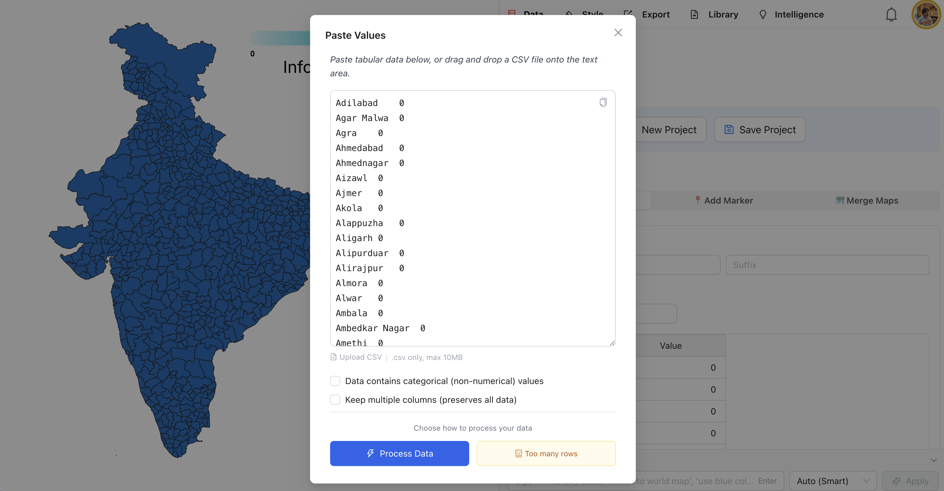
The manual way: Type it in. Below the buttons, there's a data table with every district already listed. Each row has a State column and a Value column. You can just scroll through and type in your numbers. And since scrolling through 700+ districts isn't exactly fun, there's a Search Regions box that lets you jump straight to any district.
Here's the satisfying part: as you add numbers, the map starts filling in with color right away. It updates in real time, so you can see your data come to life as you go.
Step 3: Make It Look Good
Now switch over to the Style tab. This is where things get fun.
Choose a color palette
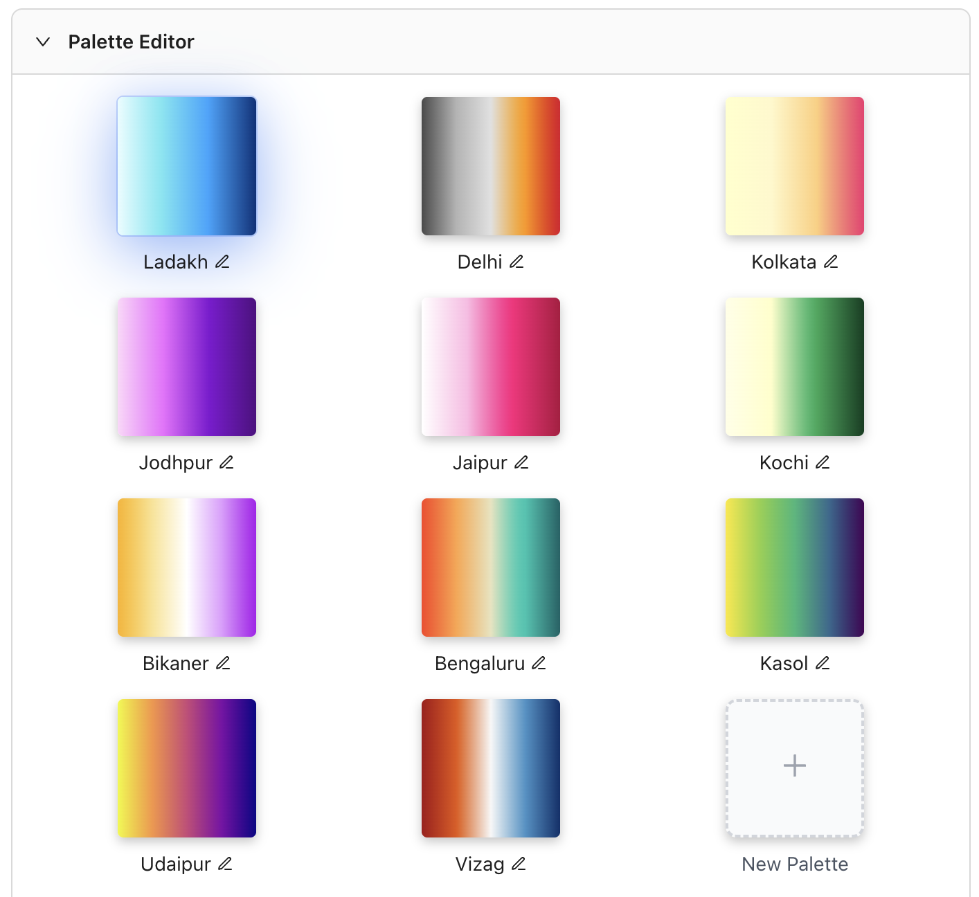
At the top, you'll find the Palette Editor with a set of beautiful, handcrafted palettes. They're named after Indian cities: Ladakh, Delhi, Kolkata, Jodhpur, Jaipur, Kochi, Bikaner, Bengaluru, Kasol, Udaipur, and Vizag. Each one has a distinct character. Just click any palette and your map transforms instantly. If none of them fit your needs, you can always build your own with the "+ New Palette" button.
Set up the legend
Open the Legend section to decide how your values get grouped into colors. You can switch between continuous mode (a smooth gradient) and categorical mode (distinct color buckets), pick how many legend points to show (anywhere from 2 to 8), and set custom min and max values if the defaults don't work for your data. There's even a Custom Intervals option if you need precise control over where each color break falls.
Deal with zeros and gaps
When you're working with 700+ districts, chances are your dataset won't cover all of them. That's totally normal, and iipmaps has you covered. Under the Values section, look for "How to handle zeros?". You get four options:
Show normally - treat zeros just like any other value
Grey region - zero-value districts show up in grey, so they're clearly different
White region - same idea, but white instead of grey
Hide region - districts with zero just disappear from the map
There's also a handy "Show regions with no data" checkbox. Turn it on if you want to make it obvious which districts you simply don't have data for, versus which ones are actually zero.
Step 4: Polish the Details
While you're still in the Style tab, take a minute to fine-tune everything:
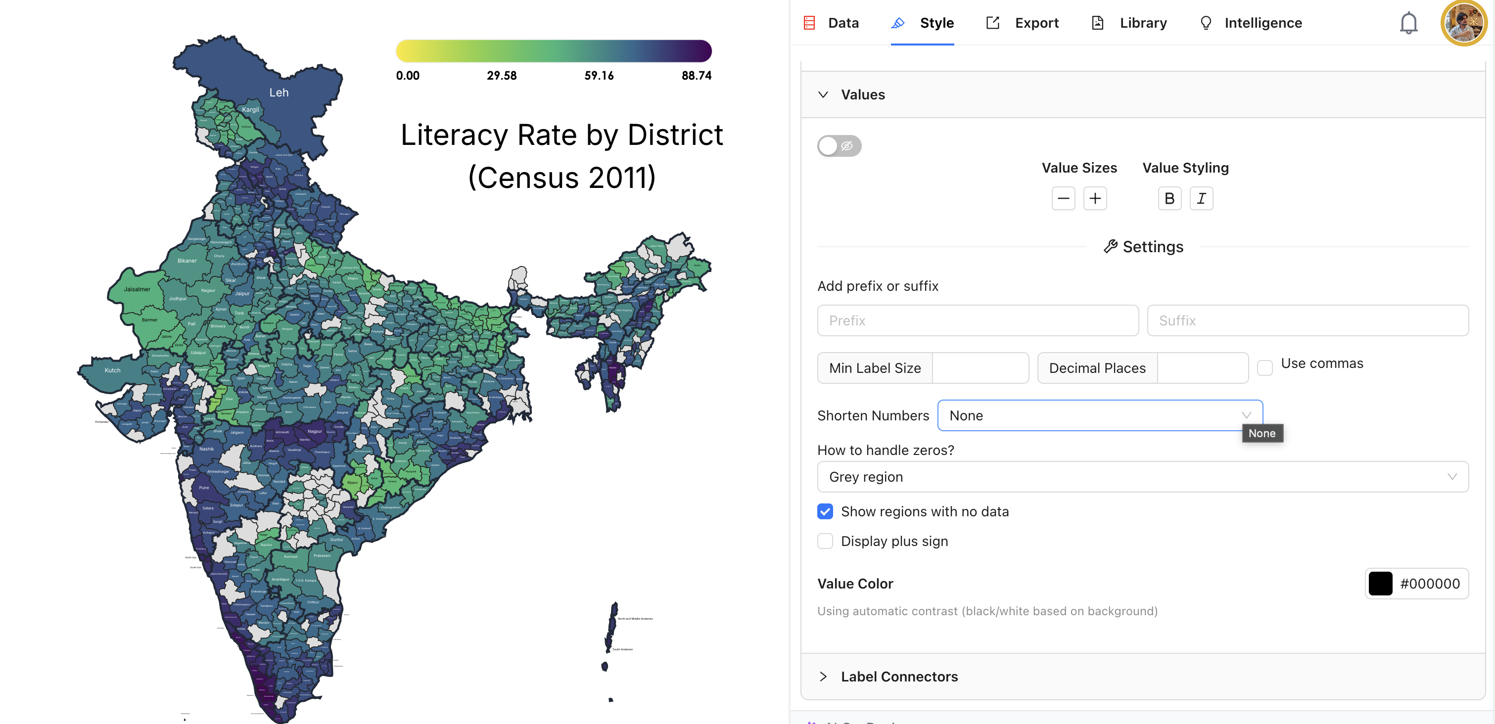
Title: Click directly on the "Infographic Title" text on the map to edit it. Something descriptive works best, like "Literacy Rate by District (Census 2011)".
Labels: You can show or hide district names on the map. Tweak the size, go bold or italic, and even change the font.
Values: Want to show the actual numbers on each district? Toggle that on. You can control decimal places, add a prefix or suffix (like "%" or "Rs."), and turn on commas for big numbers.
Number shortening: This one's really useful for Indian data. You can display large numbers in Lakh and Crore format, or use the international Metric system (Million, Billion). No more counting zeros.
Step 5: Export and Share
Happy with how it looks? Head over to the Export tab. You've got a couple of options here:
For the map image:
PNG - one click on "Download as PNG" and you've got a high-quality image ready for presentations, social media, or reports
SVG - if you need a vector file for print or want to edit it further in a design tool (this one's a Pro feature)
For the underlying data:
You can export as CSV, TSV, JSON, or XLSX, which is handy if you need to share the data alongside the visual
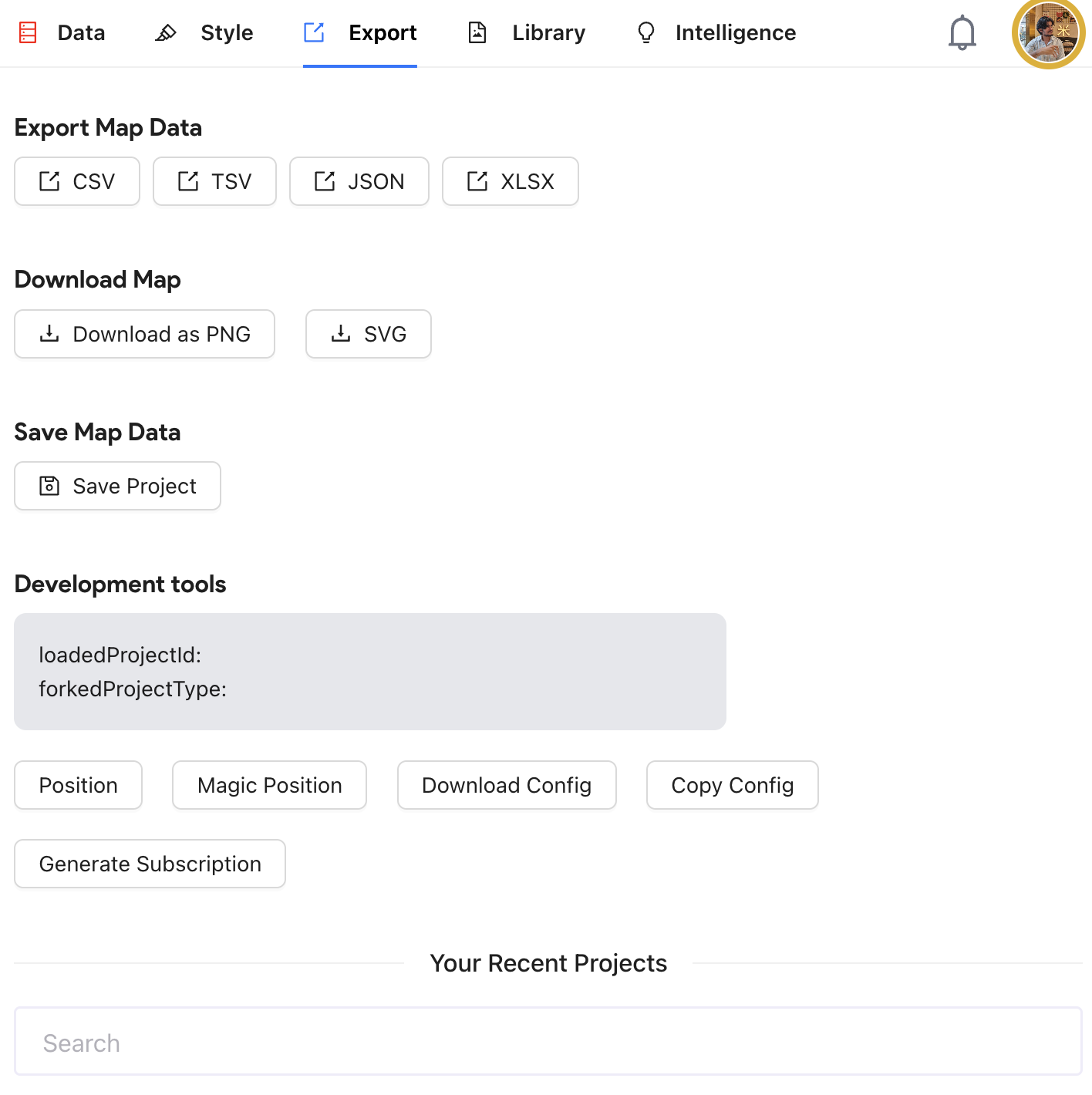
Oh, and don't forget to hit Save Project before you leave. That way you can come back and tweak things later without starting over. All your saved maps show up right there in the Export tab under "Your Recent Projects".
A Few Tips That'll Save You Time
Once you've got the basics down, these tricks will help you get more out of your maps:
Use Search Regions. Seriously, with 700+ districts, don't scroll. Just type the name in the search box and jump straight to it.
Merge districts together. The "Merge Maps" tool in the Data tab lets you combine adjacent districts into custom regions. Super useful if you're building territory maps or grouping districts by zone.
Drop pins on the map. Need to mark specific locations like offices or distribution centers? The "Add Marker" feature lets you place point markers using latitude and longitude.
Stick to Census names when you can. iipmaps handles common variations (it knows "Bangalore" and "Bengaluru" are the same place), but official Census names give the best automatic match rate.
Keep your legend simple. 4 to 6 color buckets tends to be the sweet spot. Go beyond that and the map starts getting hard to read at a glance.
What Else Can You Make?
District maps are just the beginning. iipmaps has over 60 map templates, and they all work the same way: pick a template, add data, style it, export it. Here's what else is available:
India state-level maps for when you don't need district-level detail
Individual state maps that zoom into any of the 28 states and show their districts
World and USA maps for international data
Regional maps covering Europe, Africa, Asia, South Asia, and more
Country-specific maps for places like Brazil, Mexico, China, Pakistan, Nepal, and Bangladesh
The district map of India is the most detailed one in the collection, so if you can build that, everything else will feel even simpler.
Go make your first district map — it's free to start, and yes, it really does take about 5 minutes.
