Union Budget 2026: State-Wise Allocation Visualized
A visual breakdown of the Union Budget 2026-27 state-wise allocations. See which states received the most central funding and how it compares across the country.

April 8, 2026

Every year when the Union Budget drops, newspapers print tables full of numbers. Thousands of crores allocated here, hundreds of crores allocated there. You read through the figures, try to compare states, and by the third table your eyes glaze over.
But put that same data on a map, and the story changes. You can see at a glance which states are getting the most funding, where the big jumps happened, and which parts of the country are lagging behind. We took the state-wise allocation data from the Union Budget 2026-27 and mapped it. Here's what it looks like.
The Big Picture: Where Does the Money Go?
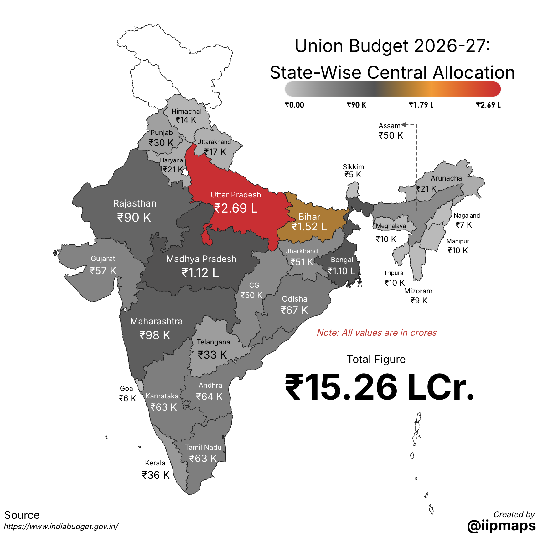
The map above shows total central allocation to each state. A few things jump out right away:
Uttar Pradesh, Bihar, and Madhya Pradesh consistently receive the largest allocations, which makes sense given their population size and the funding formulas tied to state demographics.
Smaller states in the Northeast receive lower absolute numbers, but that changes when you look at per-capita figures (more on that below).
Southern states have been vocal about receiving a smaller share relative to their economic contribution, and the map shows that contrast clearly when you compare the colors across the Vindhyas.
The numbers in the map are displayed in crores with a ₹ prefix. That's one of the things we set up in iipmaps: Indian number formatting, so "₹57K Cr" reads naturally instead of "₹570,000,000,000".
Per-Capita Allocation: A Different Story
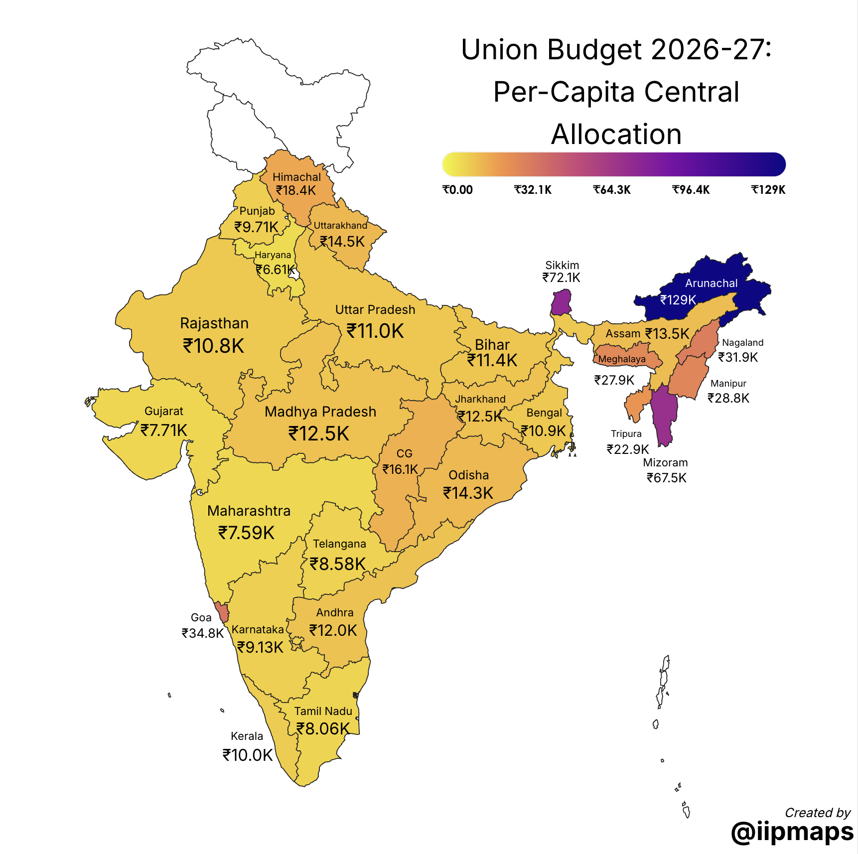
Raw numbers can be misleading. Uttar Pradesh gets the most money because it has the most people. So what happens when you divide allocation by population?
The map shifts. Northeastern states jump to the top. States with special category status tend to receive more per person. The large states that dominated the first map don't look quite as favored anymore.
This is exactly why maps are useful for budget data. The same dataset tells a completely different story depending on how you present it. A table gives you the numbers. A map gives you the geography, and the geography is the part that drives the political conversation.
Year-Over-Year Change: Who Got More, Who Got Less?
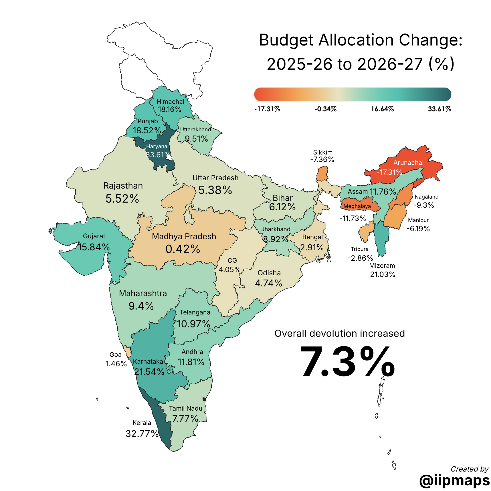
This map shows the percentage change in central allocation from last year's budget to this year's. Green states saw an increase. Red states saw a cut or stagnation.
A few patterns worth noting:
States with upcoming elections tend to see allocation bumps. It's a pattern you can trace across budget cycles.
Infrastructure-heavy states (where major highway or rail projects are underway) often get larger year-over-year increases tied to project milestones.
States that underutilized previous allocations sometimes see flat or reduced funding in the next cycle.
For this map, we used a diverging palette: green on one end, red on the other, with a neutral middle. The "Treat values as categories" option wasn't needed here since the data is continuous, but we did set custom legend intervals to make the breakpoints meaningful (like -17.31%, -0.34%, 16.64%, 33.61%).
How We Made These Maps
All three maps above were built in iipmaps using the India state-level template. Here's the quick version of the process:
Template: We used the "India" template, which shows all states and union territories.
Data: We compiled state-wise allocation figures from the budget documents and pasted them in using the "Paste Values" button. Two columns: state name, allocation amount.
Number formatting: Turned on Indian number shortening (Crore) and added a ₹ prefix. The values display as "₹15,234 Cr" instead of raw numbers.
Palette: Used "Delhi" (graey gradient) for absolute allocation, a different palette for per-capita, and "Bengaluru" green-red diverging palette for year-over-year change.
Legend: Set custom intervals for meaningful breakpoints rather than letting the tool auto-calculate. For budget data, you want categories that make sense in context (like "under ₹5,000 Cr", "₹5,000-10,000 Cr", etc.).
Zero handling: Showed empty regions in white so it's clear which territories have no separate allocation (some union territories are administered centrally).
Total time: about 5 minutes per map, including data entry and styling.
What Budget Maps Can Tell You That Tables Can't
Tables are precise. Maps are spatial. And for budget data, the spatial dimension is where the interesting stories live.
Regional clusters become visible. When you see a band of heavily funded states across North India, or a cluster of underfunded states in the South, that's a pattern a table buries across 30 rows. The map shows it in a second.
Outliers pop. A single state that's significantly over- or under-funded compared to its neighbours stands out visually. In a table, it's just another row.
The conversation shifts. When you present budget data as a table in a meeting, people debate individual numbers. When you present it as a map, people talk about regions, equity, and distribution patterns. The map frames a different kind of discussion.
Try It with Your Own Budget Data
The Union Budget isn't the only budget worth mapping. State budgets, department budgets, CSR spending, grant distributions: any data that has a geographic component and a funding component looks better on a map than in a table.
You can replicate any of the maps above in about 5 minutes:
Go to iipmaps and pick the India template
Paste your state-wise data
Turn on Indian number formatting (₹ prefix, Crore shortening)
Pick a palette that fits your data's story
Set custom legend intervals for meaningful breakpoints
Export and share
The data is public. The tool is free to start. The map takes 5 minutes. What used to require a GIS analyst and a week of turnaround now fits in a coffee break.